
Timeline:
4 Weeks
Role:
UX/UI Designer
Figma | Wordpress | Illustrator | Photoshop
Case Summary
Problem
Biotech information is often complex, making it difficult for both the general public and investors to understand.
Company
Arrivo BioVentures LLC is a biotech company developing innovative therapies, with a pipeline that includes treatments for major depressive disorder and acute pancreatitis.
Impact
Patients and investors can easily find the resources they need and quickly absorb the information. Clear illustrations make it simple to understand how the product interacts with the body.
User Needs
Users will value responsive content on mobile devices, enhancing
engagement and encouraging return visits.
Users will value an intuitive navigation to reduce cognitive load.
Users will value visuals that clearly convey the medical products'
uses and current development phases.
Users will value clear calls-to-action (CTAs) to learn more about
Arrivo's products and access investor-worthy articles.
Design Challenge
How can Arrivo BioVentures’ website clearly convey its shift to a patient-focused biotech company while optimizing user experience, functionality, and investor engagement?
Research…Research…Research


I analyzed the current website's pain points and examined the features of competitor websites.
Afterwards, I spoke with the CEO to set clear expectations for the website, which helped me finalize the user needs. This analysis aimed to identify opportunities for improvement, aligning with Arrivo's patient-centered approach.
Initial Wireframes

After research, I designed wireframes using logo-derived colors to align with the CEO’s
vision. News updates served as the primary CTA, keeping users informed about
Arrivo’s advancements.
I curated patient-focused imagery to enhance content alignment and streamlined elements to reduce cognitive load and scrolling. To improve clarity and navigation, I simplified content structure and incorporated intuitive linking.
Finalized Wireframes

This new iteration of high-fidelity frame showcases my direction to a blue/orange color scheme to convey trust and reliability. I made the CTA more prominent on the homepage and introduced new graphics to enhance the visual communication of Arrivo's medical products.
Figma to Wordpress
The shift from Figma to WordPress proved trickier than expected. From dealing with rounded frames to struggling with tab content, each hurdle forced me to get creative—sometimes leading to unexpectedly positive results.
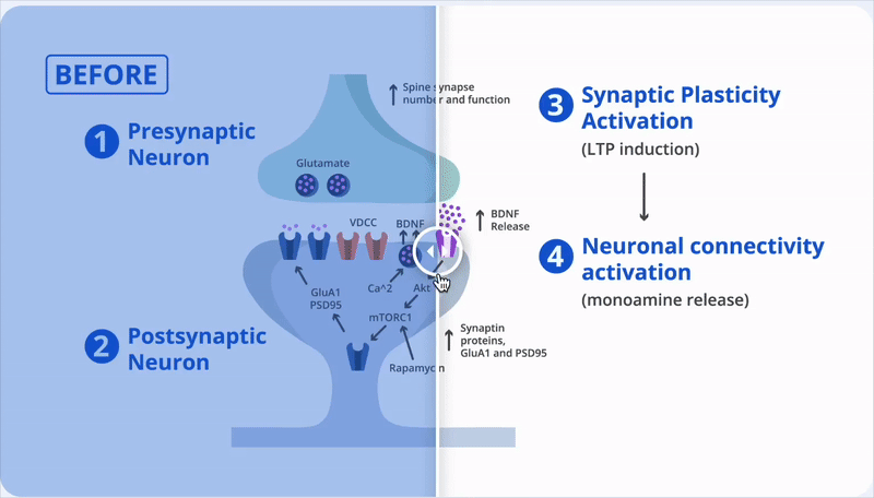
Before and After
I focused on showing where the product makes an impact. A simple before-and-after scroll revealed its effect on neurons, technical for patients yet clear and compelling for investors.

Anchor Links
Although WordPress offered content tabs, the company’s plugin limited customization. I could add text but not a button to link to a news page. To solve this, I used anchor links to make navigating the news pages easier.
Infographics

I replaced videos with clear graphics to decrease cognitive load. I also refined the color scheme and redesigned the timeline to better illustrate the medical products’ progress.
Reflection
To stay on track with deliverables, I adopted an agile approach, using dedicated time blocks for research and design refinement. I streamlined my wireframing process in Figma and met with the CEO weekly to ensure the designs aligned with both his vision and user needs. Looking ahead, I would explore using AI to create coded components that align with the high-fidelity wireframes.