
Timeline:
5 Weeks
Role:
UX/UI Designer
Figma | UX Research | Illustrator | Framer | Photoshop
Case Summary
Problem
Parents seeking speech therapy often face language barriers online, making it hard to find clear information about services and support for their children.
Company
About Speech is a speech clinic offering speech, feeding, and early intervention services towards kids at birth to age 21.
Impact
Digestible and bilingual content ensures families understand how the clinic can support their child’s communication journey.
User Needs
Users need a smooth mobile experience
Users need simple, medical-jargon-free explanations of therapies.
Users value a quick source to answer common questions about the therapy timeline.
Parents value accessible ways to contact the clinic outside business hours.
Design Challenge
How can About Speech’s website make therapeutic information accessible and approachable for both English and Spanish-speaking parents while building trust and helping families navigate services for their children?
Learning from the Neighborhood
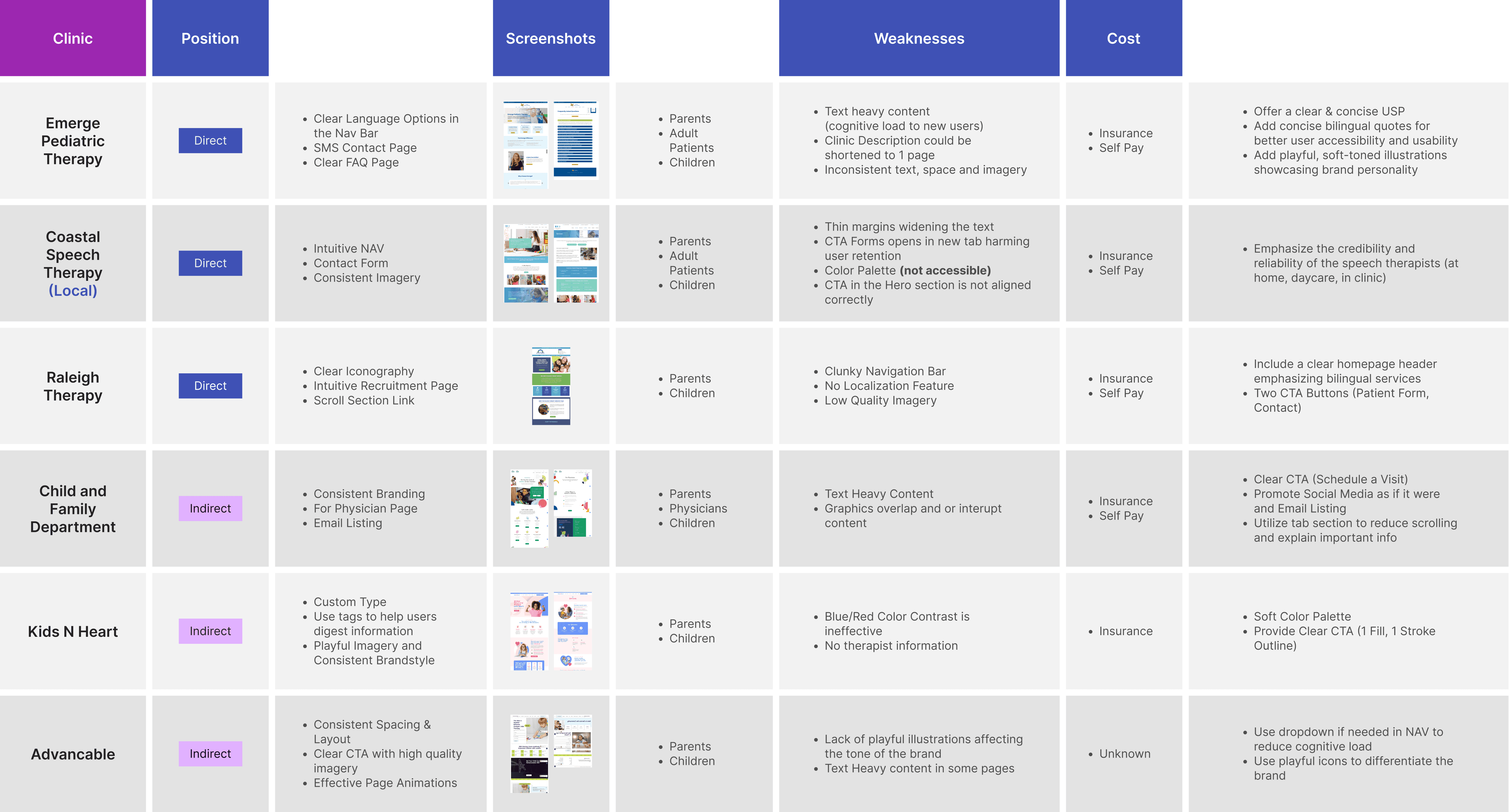
To better understand user expectations, I researched both direct and indirect competitors. I found it essential to consistently highlight the clinic’s unique strengths: flexible therapy locations and bilingual staff.
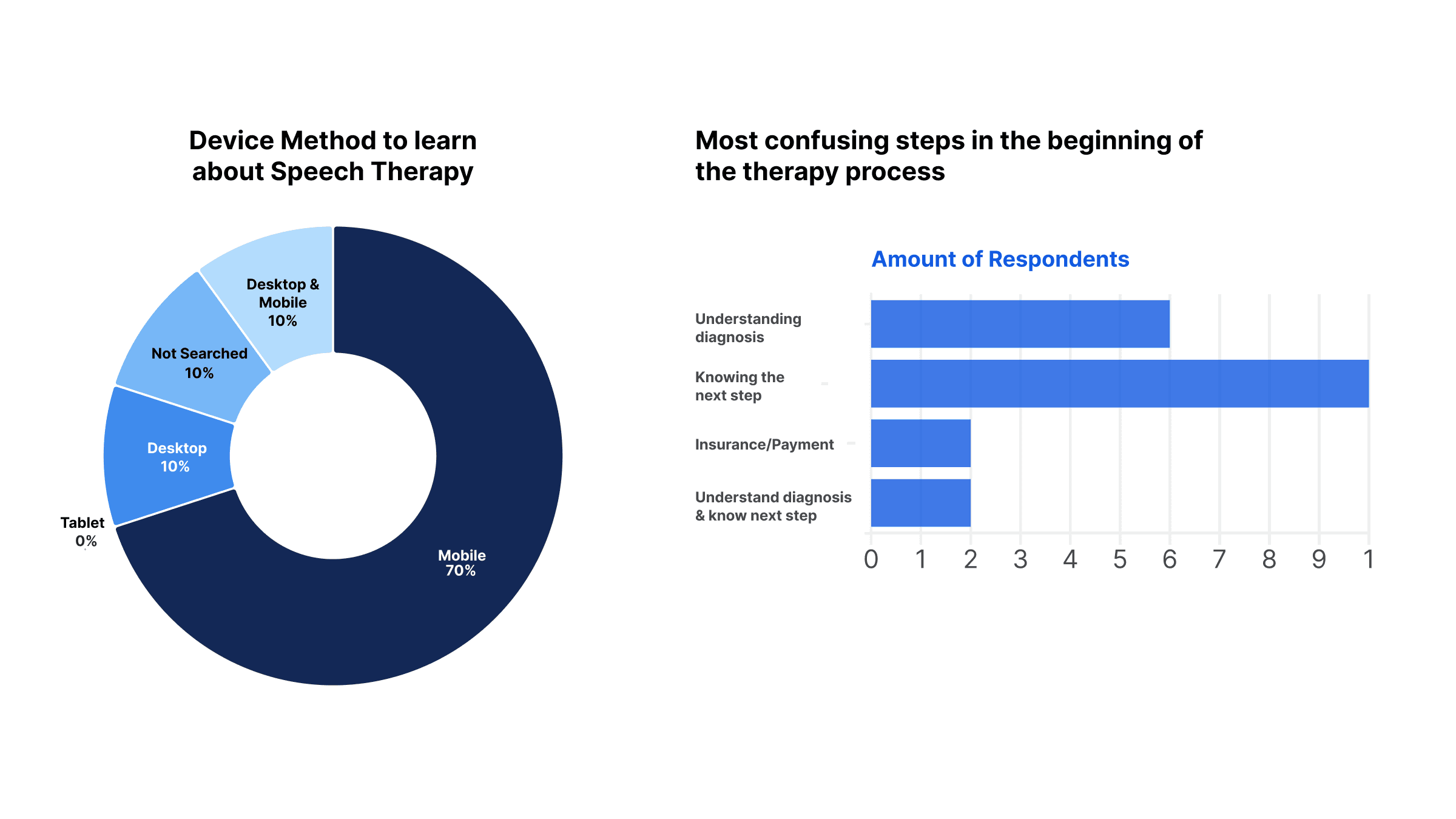
To better understand the audience, I distributed 20 printed surveys (10 in English and 10 in Spanish) at the clinic’s primary location. While this captured only one touchpoint (in-office visitors), the insights revealed important pain points.
Many parents relied on mobile devices to learn about diagnoses and next steps, and several were unfamiliar with the importance of speech therapy. These findings guided me to highlight both the convenience of mobile access and the benefits of therapy in the clinic’s messaging.
Crafting a Sitemap

To avoid confusing user pathways, I worked on a user sitemap. I realized that the contact form needed to be concise to prevent users from leaving the contact page. This sitemap also supported content planning to see where content can overlap.
Initial Wireframes

I designed the site mobile-first to ensure it worked seamlessly for most users. I refined the copy provided by the About Speech team for persuasiveness and added dropdowns to reduce scrolling, along with small tags to highlight therapy benefits.
Exceeding User Expectations
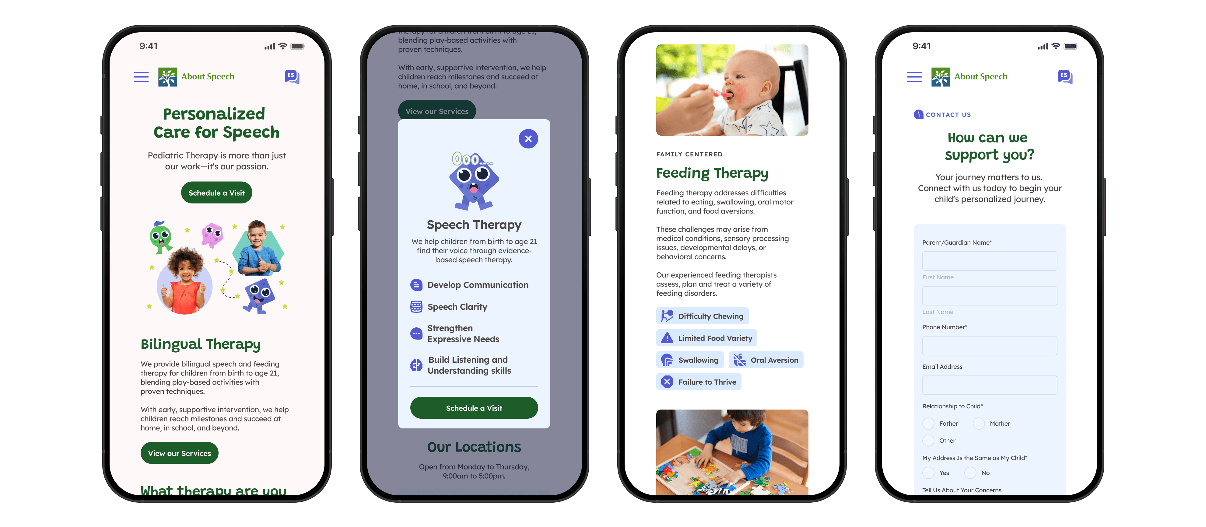
The UI needed to be visually strong to help the clinic stand out from competitors. Since the services are aimed at children, I focused on strong visuals and consistent colors to create a playful yet proffesional tone. In this iteration, I used modals to isolate content and draw attention while giving the design room to breathe.
Figma to Framer

Since my designs would eventually live in Framer, I searched for plugins that could bridge the gap from Figma. That’s when I discovered "Figma to HTML to Framer." With it, I could drop my static screens straight into Framer and jump right into prototyping, adding responsiveness there instead of repeating steps in both tools.
This taught me the value of finding the right tools early, as even small efficiencies can make a big difference in fast-paced projects.
Usability Testing

Adding Clarity to Localization
I learned that the language button confused users. On mobile, many mistook it for decoration, while on desktop, they expected a dropdown list. Since the site only supported English and Spanish, I switched to a toggle, which was more responsive and reduced the steps needed to change languages.

Reducing Steps
I introduced tabs to let users move seamlessly between therapy service content.
This approach simplified the flow and adapted well to mobile, where the content could be stacked for easier navigation.

Segmenting the Audience
The administration team noted that many parents often called the clinic with questions. To address this, I designed a simple form for quick questions and concerns, paired with a button linking to the full digital case history form.
Reflection
At first, I assumed the project would be simple, but research and parent surveys showed me the need for more intentional design. Every visual had to support the message, and buttons needed clearer labels with fewer clicks since most users were on mobile. I also learned audience segmentation by creating two different contact forms, ensuring their needs were better met.